Changes overview
1. A new CMS system was created with logic linking to multiple sections of the website via onesingle editable dashboard with instructions and required fields for content editors.
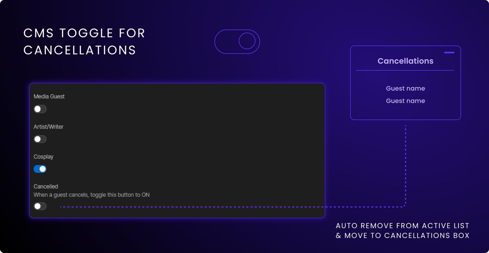
2. Cancellations were kept up to date with a toggle feature added into the CMS panel that when activated would automatically remove the cancelled guest from the active list and add the name into the cancellations box.
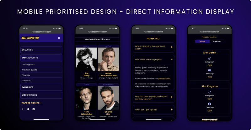
3. Adapted design for mobile users based on the data that 80% of users were from mobile devices. The navigation was completely overhauled and designed for mobile first along with all screens being adapted.
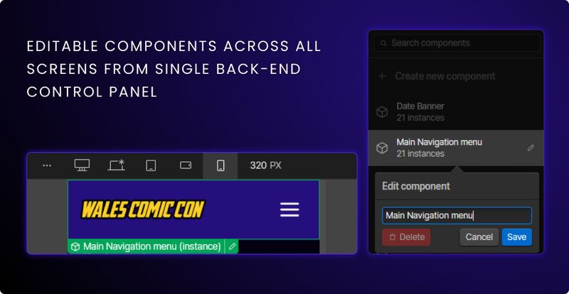
4. Components added for easy editing across pages to create a more streamlined approach to changing information between events. This greatly improved the consistency across the site and reduced issues such as outdated links and buttons being left up.
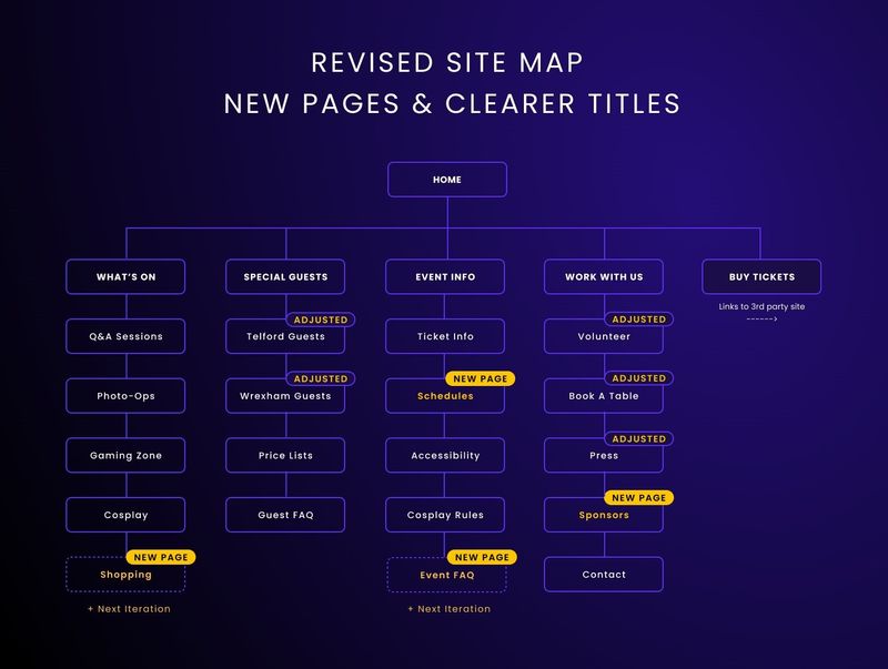
5. Adjusted site map: Additional pages were added based on user requests and research along with renamed navigation elements using more accurate and descriptive titles.
Screens
Compromises & considerations
A general landing page redirecting to other specific event pages was considered, or rather, using a "hub and spoke" dashboard model. With different colour schemes, branding, and naming conventions to depict that it's a different event site.
Due to time constraints and factors such as potentially causing confusion to customers, this direction wasn't taken. The combined approach while not ideal, was considered the best approach for this iteration. The main goal was to focus on and fix the more immediate issues first.
Filters and search functions while great quality of life features for the website, they were not feasible in the short time span available. The additional functionality would have extended the launch date considerably, and has been added to the backlog for future implementation.
Some "nice to have" pages were added to the backlog to apply in future iterations.